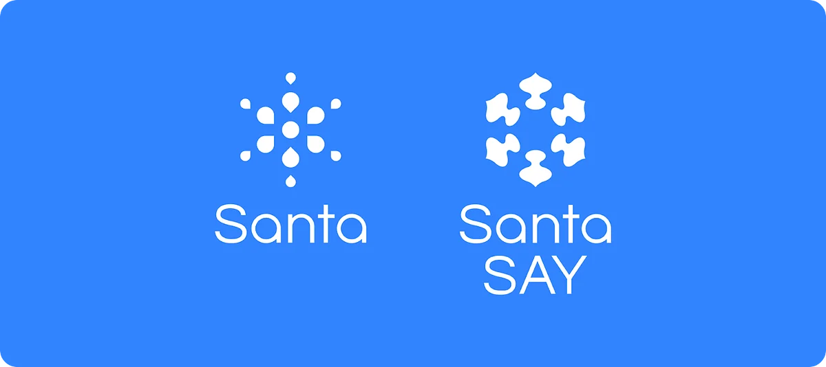
Hello. I’m Jusang Jang, a brand designer at Riiid. This is the second retrospective article on the Santa Say brand design process.
In the previous article, “In the Process of Building the Minimum Brand Identity,” through MVB work, we involved product stakeholders in the brand process with the minimum necessary documentation and derived the brand impression, mission, and naming needed to visualize Santa Say’s identity. This time, I would like to look back on the brand visualization process.
**Balancing consistency and diversity
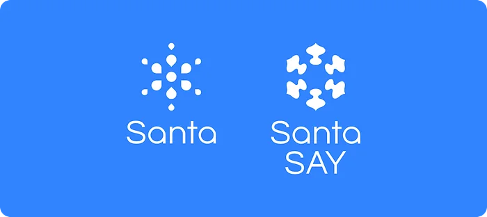
**Santa Say, a TOEIC Speaking test-prep service, was defined in its brand hierarchy with Santa as a ‘Sub Brand.’ However, even within a ‘Sub Brand,’ the question remained as to how much diversity or consistency it should have with the upper Master Brand. In conclusion, we decided to keep the same font weight as Santa and create a brand symbol unique to Santa Say. This was intended to avoid the misperception tied to Santa being recognized as a ‘TOEIC’ service and to evoke the TOEIC Speaking test, which proceeds through ‘speech, that is, spoken language.’
**Santa Say’s sign: signifier and signified
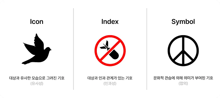
**When building a ‘sign’ called a ‘symbol’ as a brand identity element, one naturally begins to think about the physical form of the ‘signifier’ and the ‘signified,’ the meaning and concept indicated by that signifier. (The signified can also be defined as Content, and the signifier as Form.) In visually materializing a symbolic sign, brand designers always face the question of which to define first: the signified or the signifier. In Santa Say’s case, since various signifiers could exist depending on how the signified was defined, we chose the approach of defining the signified first and then extracting the signifier.From the outset, to define Santa Say’s signified, we discussed what absolutely had to be conveyed through the final output, the ‘sign (symbol).’ We focused on the essential difference between the ‘TOEIC’ and ‘TOEIC Speaking’ exams: the latter is based not on text, but on speech-utterance-voice. Also, because the product’s core STT* feature enables score prediction and grammar correction, we adopted ‘speech sound’ as the brand signified.
*An abbreviation for Speech-to-Text, referring to technology that converts speech into text.
**Signifier: exploring signifiers of speech sound
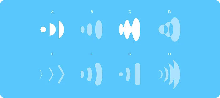
**We laid out images related to speech sound-voice-conversation and explored the commonalities among them and their potential to develop into an identity. At this stage, rather than seeking signifiers that people would not understand, it was important to explore signifiers that are commonly recognized, so that when people saw the final symbolic sign, they could infer and recognize its contents. Since speech sound cannot be seen, it was necessary to examine various indexes and symbols that diagram it. To do this, we searched terms such as speech sound or sound across various search engines, scraped the signifiers people encounter and recognize most often, laid them out so they could be viewed at a glance, grouped commonalities across the signifiers, and identified derived sub-signifiers.
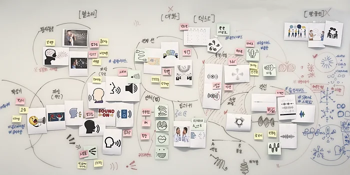
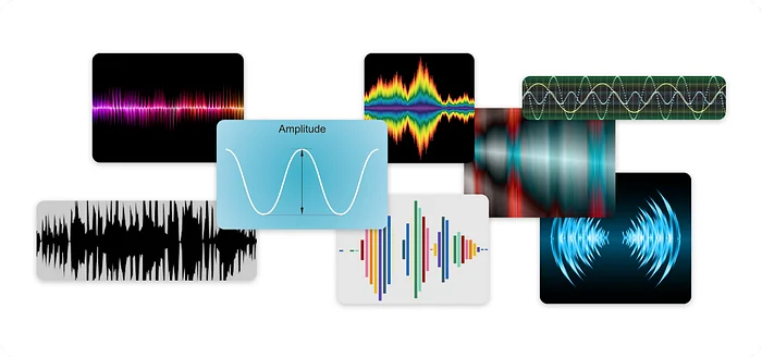
**[Goal 2] Discovering a signifier that represents a conversation-based learning service **Afterward, we extracted the expression most suitable for the brand’s final sign by considering whether the signifier intuitively evoked what the signified represents, whether the form of the signifier was simple and scalable, whether it contained any expressions that could cause misunderstanding, and whether there were any other cultural issues associated with it. In the end, we selected ‘sound wave’ as Santa Say’s visual signifier. We considered it an effective signifier for intuitively expressing the speech sound of the ‘TOEIC Speaking’ test, which focuses on evaluating spoken fluency, pronunciation and sentence structure accuracy, the flow of content in a question-and-answer format, and vocabulary usage—all conveyed through sound waves generated with varying highs and lows.
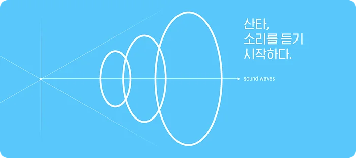
**Santa begins to hear sound. **Once the signifier was decided, what remained was the task of expanding it in various ways. How could we create a brand sign unique to Santa Say using sound waves? Countless forms could be made from sound waves alone. At this point, we considered the goal that had to be achieved: “to be recognized as a family brand with Santa.” Therefore, we had to consider situations in which it would be shown alongside the Santa brand and think about a formative structure that could signal it as a family brand.

As a solution, we decided to apply the same formative structure as Santa. Santa’s formative structure uses a node-graphic-based design with X, Y, and Z axes in order to reveal the characteristics of artificial intelligence while establishing a distinctive visual identity. There were concerns that this systematic application might create a somewhat monotonous feel. However, we believed it was a structure that could communicate that Santa Say is a family brand with Santa, and we judged that the individual element structure of the sound waves would offset the monotony of repetition and become an independent formative element expressing the brand’s identity.
Get Jusang Jang’s stories in your inbox
At this point, when we decided to use the ‘sound wave’ signifier, we also worked to avoid the misconception that the business was similar to music streaming services or audio & broadcasting product brands.
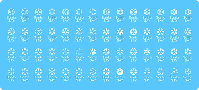
**[Goal 3] Building a service identity differentiated from competing services **We created a total of 56 variations based on element forms. Due to the characteristics of a structure in which a single element is repeated, we produced as many drafts as possible that could change the overall impression through even small details in form and spacing values. We also wanted to create an opportunity to develop the visual language by reviewing forms with various possibilities. Among the many proposals, we explored options that could find Santa Say’s uniquely distinctive recognizability and visual stability, while also providing flexibility for developing brand graphics that could later expand the brand image.
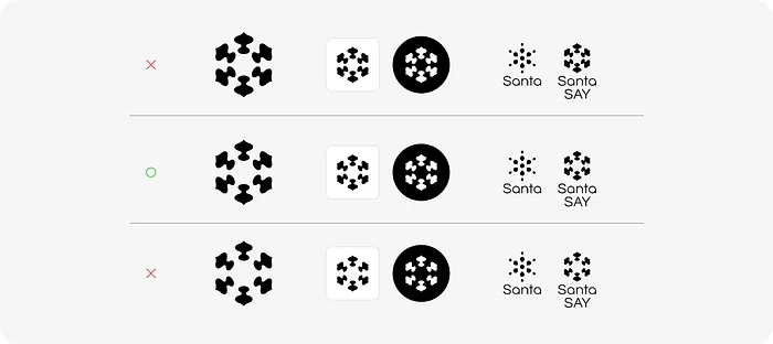
To make the selected design more stable, we applied visual corrections to the detailed form. Because the spacing values of the hexagonal node-based waveform structure Elements affect the overall size of the symbol form, we adjusted the spacing of subtle formal details and refined the detail values of the Elements within a standardizable range. Since it needed to be properly recognized in web environments, we adjusted the detail values for on-screen legibility and suitability at minimum sizes. Excessively strong soundwave forms could unintentionally evoke an Oriental image, so this also required adjustment.

**Expanding brand meaning, brand graphics that secure diversity **With the visual corrections complete, we arrived at Santa SAY’s final brand identity. But beyond the brand identity itself, the brand also needed its own graphic assets. If the logo work was about compressing various meanings into a single form, brand graphics help unpack those compressed meanings to support a more diverse brand image and a clearer understanding of the service. By using overlapping equalizer-style soundwave graphics, we aimed to express the core values that Santa SAY delivers. We also sought to further expand those meanings by adding multiple derivative graphics.


**Branding based on listening to the voices of internal and external customers
**This brand project was carried out by sharing every step with the brand team and product stakeholders, from defining the brand hierarchy to naming, establishing the brand mission, exploring the signifier of meaning, and developing it into concrete outcomes. By listening to the product team’s opinions and building the brand identity based on them, we achieved three internal organizational goals and are currently receiving positive responses across various channels, including reviews. Going forward, we will need to continue verifying whether the brand identity is functioning properly across areas such as user response to the SAY product, awareness, satisfaction surveys, and sales data analysis, while steadily building the brand image.
Through this project, I was personally able to grow in two major ways. The first was understanding and applying an MVB brand design process suited to a fast-moving technology company. Brand design is not simply about creating visual elements; it is about expressing a brand’s identity and values. Therefore, designers must deeply understand the brand’s vision and mission, target customers, and competing brands, and design based on that understanding. Through this project, which focused on building a minimum viable brand identity, I was able to clearly understand once again the factors that need to be considered at each stage, and identify the areas that should be shortened further or receive more focus in the future.
The second was product and market understanding. Brand identity is a message delivered to customers together with the product. Therefore, to concretize a brand identity, it is essential to deeply understand the product’s characteristics, functions, and target customers. Through this project, I gained experience in understanding the product’s functions and features, as well as the English test-prep market’s understanding of “TOEIC Speaking,” and further reflecting that in the brand identity.
_These days AI can even make logos… what is the future of brand designers?
_
The role of brand design in technology companies in the age of AI, and its future direction, are clear. AI can only generate forms based on input data; the work of creating forms that embody specific values for actual stakeholders and persuading them of the results belongs solely to human designers. Therefore, the ability to understand a brand’s core values, visualize them effectively, and explain them will become even more important.
If you’d like to learn more about Santa SAY,
→ Go explore Santa SAY